The Printed Image: “Phiz” and the Illustrated Works of Charles Dickens
This February installment of ‘The Printed Image’ serves as a belated commemoration of the birthday of Charles Dickens (February 7), by highlighting the work of one of his most frequent illustrators, Hablot Knight Browne (1815-1882). Also known by the pen name “Phiz” to complement Dickens’s own moniker “Boz”, Browne illustrated seven of Dickens’s fifteen novels, among them Nicholas Nickleby, The Old Curiosity Shop, Dombey and Son, David Copperfield, Little Dorrit, and A Tale of Two Cities.
Browne’s illustrations for Dickens are represented in Falvey’s Special Collections in two works: a complete set of the original serialization of The Life and Adventures of Nicholas Nickelby from 1838-1839, and in The Writings of Charles Dickens, a 32 volume set printed by the Riverside Press in Cambridge, Massachusetts, published by Houghton Mifflin & Company in 1894.
(Click on the illustrations in this blog post for a larger view.)
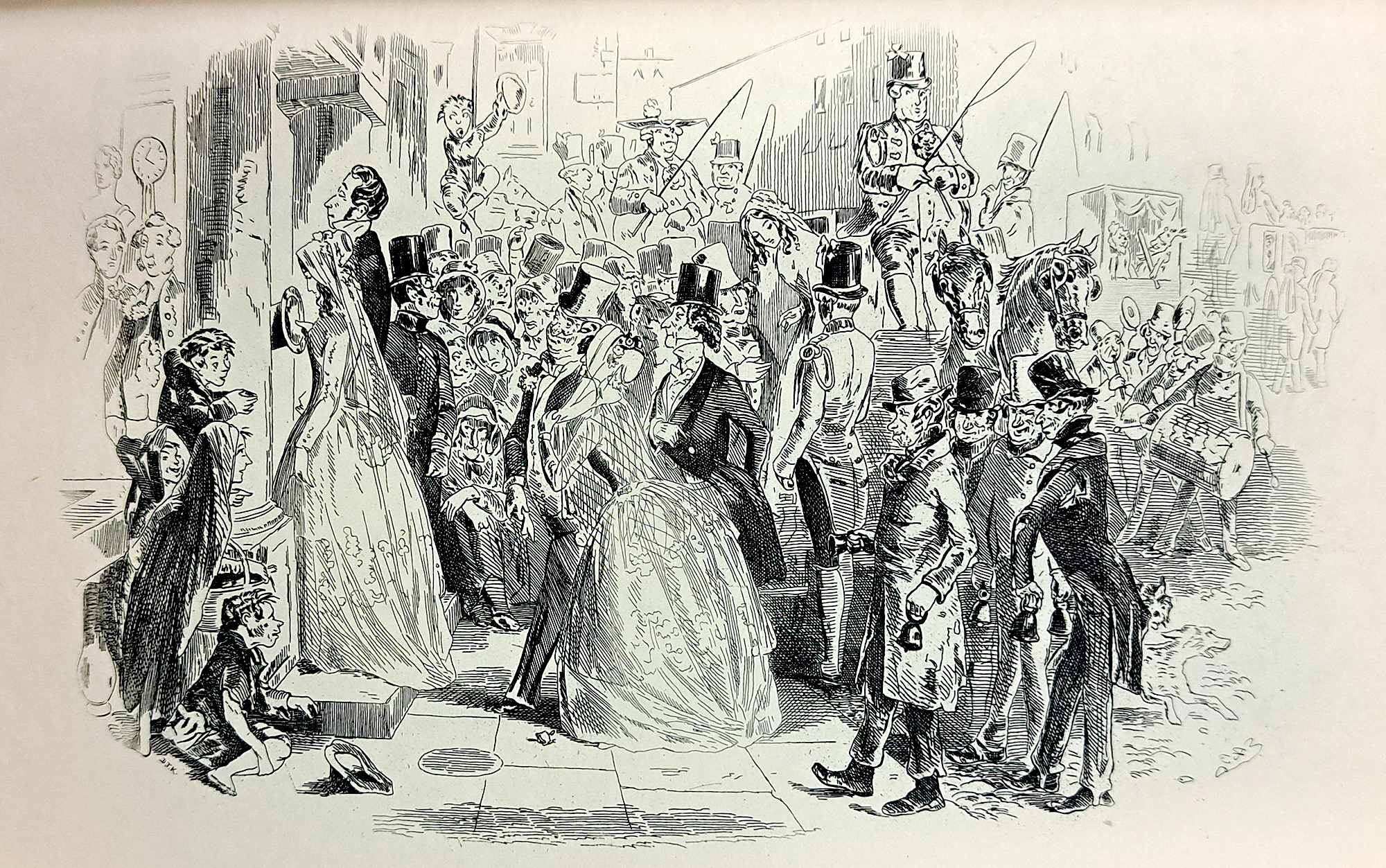
“I am married”
from David Copperfield
When I first encountered Browne’s illustrations in Dombey and Son, I was struck by how contemporary they appeared to be; their humor, their expression, their energy. It was a style I could see traces of in modern day comics, cartoons, and illustrations, yet I was surprised to discover they were made and published for the original serializations. The stories of Charles Dickens as “classics” can sometimes have an imposing reverence, so to see how they were published to a Victorian-era public helped to make them more accessible.
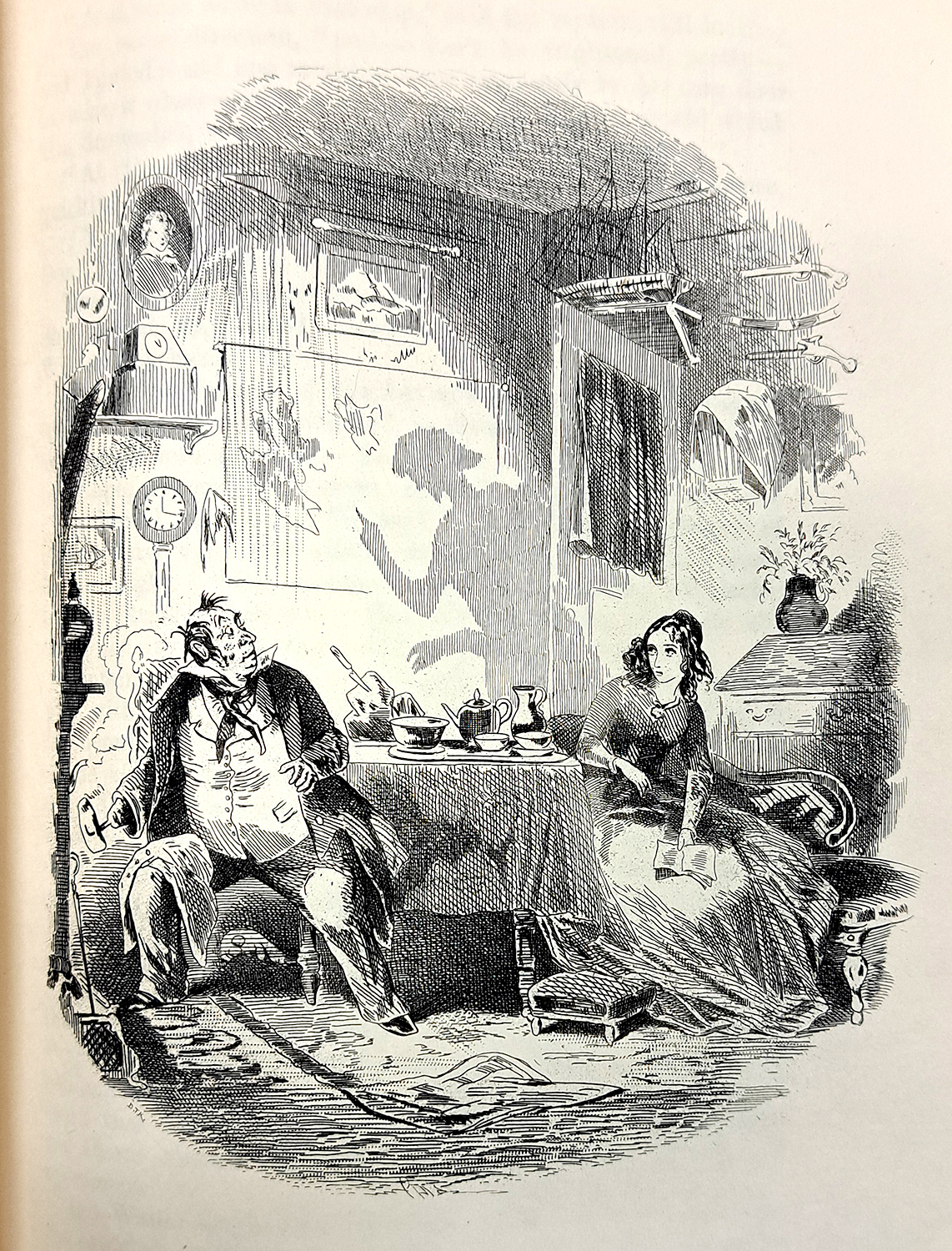
“The Shadow in the Little Parlour”
from Dombey and Son
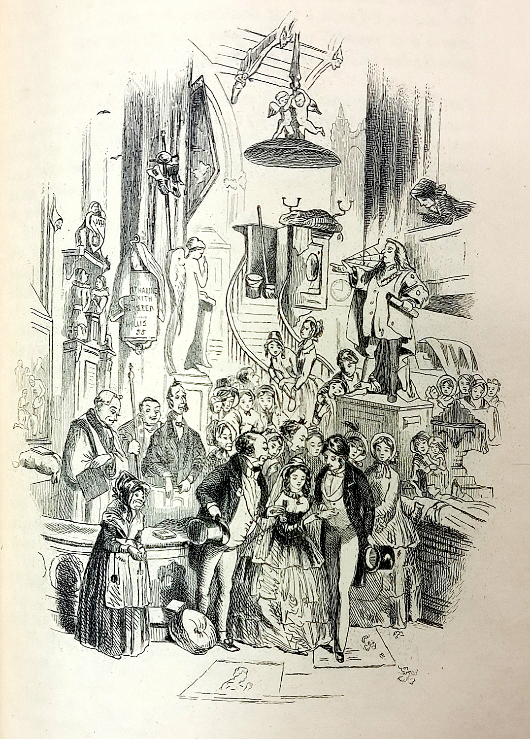
“Coming Home from Church”
from Dombey and Son
Browne belonged to a ‘caricaturist’ school of illustration that was popular at this time, a style that included other Dickens illustrators such as George Cruikshank and John Leech, but was opposed aesthetically by the more formal Royal Academician style. As Browne’s son Edgar wrote,
“To this faculty of reproducing at will unconscious impressions he owed most of his excellences, together with most of his faults. Careful adherence to fact, and conscientious reproduction of the model and still life, would have resulted in drawing that might have had a great artistic value, but would not have represented Dickens in the slightest degree.” [1]
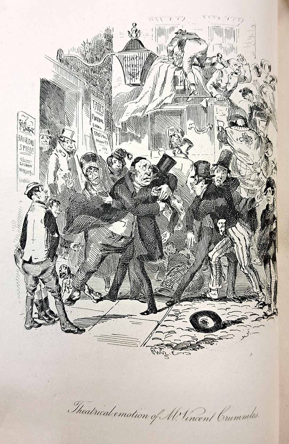
“Theatrical emotion of Mr. Vincent Crummles”
from Nicholas Nickleby

“The last brawl between Sir Mulberry and his pupil”
from Nicholas Nickleby
While Browne was initially apprenticed as a line-engraver to William Finden, he left this apprenticeship to start his own studio with Robert Young, preferring etchings and watercolors for his artistic output. [2] While engraving uses fine tools to create a design on metal or wood, etching is a method where a drawing or design is incised onto a metal plate with acid, allowing for an illustrator’s drawing style to be more readily replicated for the printed page, as a stylus is used to define the areas that will be etched. We can see evidence of this in Browne’s mark-making in the illustrations and in his extensive use of hatching and cross-hatching.
One intriguing aspect that can be found in some of Browne’s illustrations is the use of a “dark plate” method, where a gray tone is used within the background, created using a ruling machine on the plate. [3] This was undertaken partly as a way to control how the illustrations were reprinted; due to the popularity of Browne’s illustrations, publishers would reproduce them through lithographic stones, a practice which displeased Browne. The dark plate method made it nearly impossible for this kind of transfer to occur, thus bringing Browne some measure of artistic control. [4]
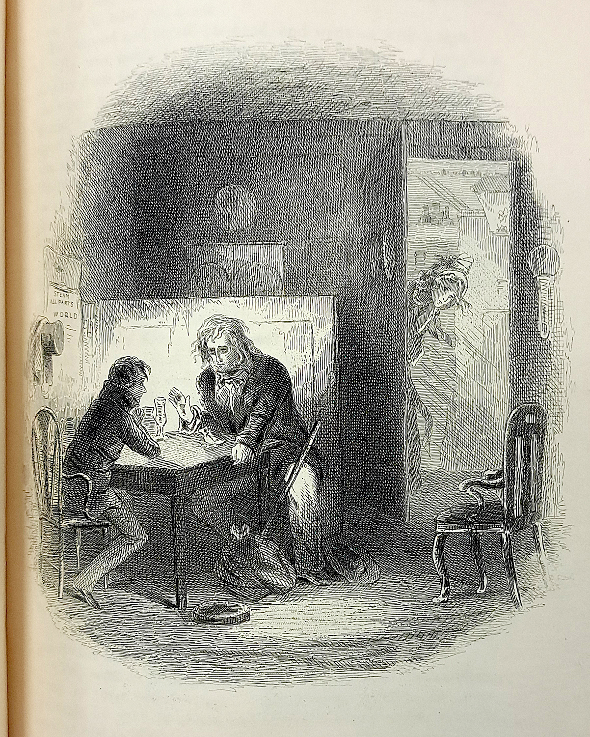
“The Wanderer”
from David Copperfield
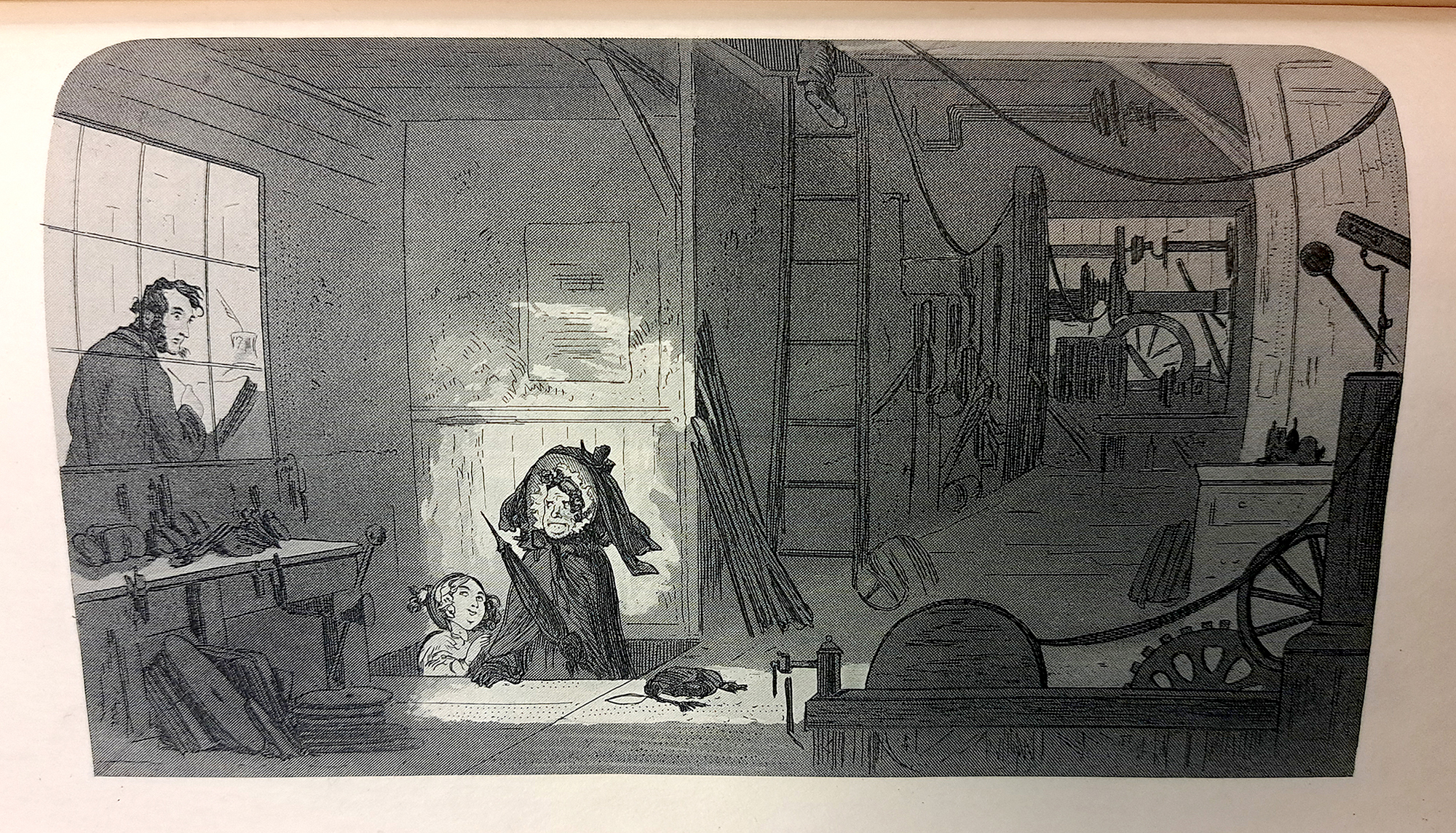
“Visitors at the Works”
from Little Dorrit
(‘dark plate’ illustration)
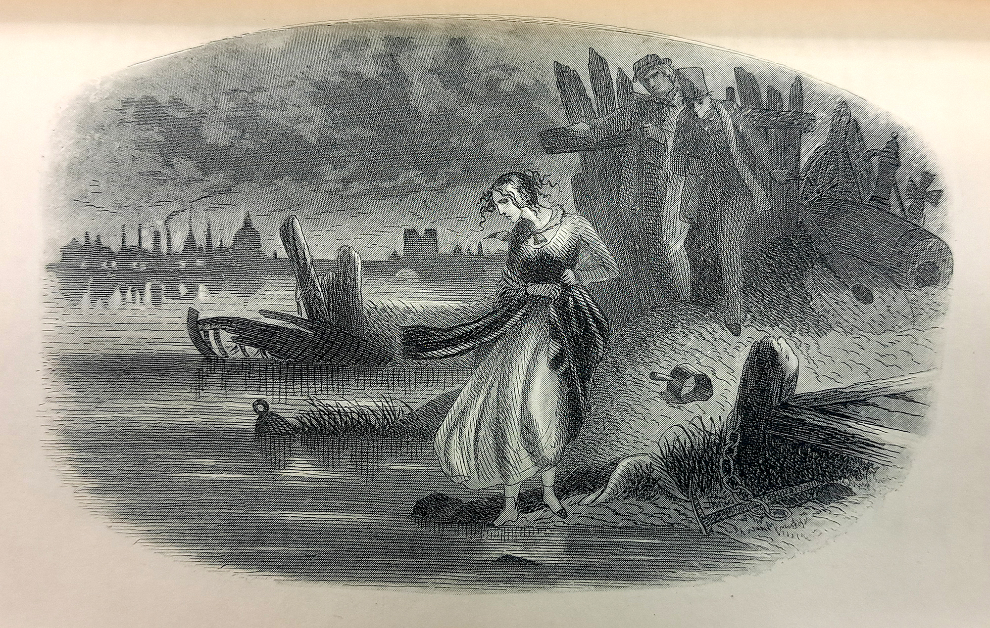
“The River”
from David Copperfield
(‘dark plate’ illustration)
Nicholas Nickelby and The Writings of Charles Dickens may be viewed in the Rare Book Room by appointment. Falvey’s Digital Library includes a Charles Dickens collection, which includes a volume of collected works, illustrated prints, and letters written by Dickens. To see more work by Hablot Knight Browne, you can visit the British Museum and the Royal Academy. To learn more about the etching process, visit this tutorial at the Metropolitan Museum of Art.
Finally, if you happen to be visiting Philadelphia, stop by the Free Library’s Rare Books department to visit Grip the Raven, who has a most curious connection to both Charles Dickens and Edgar Allan Poe.
Mike Sgier is a Distinctive Collections Coordinator at Falvey Library.
References
[1] Simon, Howard. 500 Years of Art in Illustration. New York : Hacker Art Books, 1978. Page 114.
[2] “Hablot Knight (Phiz) Browne | Artist | Royal Academy of Arts.” www.royalacademy.org.uk, www.royalacademy.org.uk/art-artists/name/hablot-knight-phiz-browne.
[3] “Hablot Knight Browne (1815-1882).” Illustrating Dickens’ World – WPI Digital Exhibits, 27 June 2023, exhibits.wpi.edu/spotlight/illustrating-dickens/feature/hablot-knight-browne-1815-1882.
[4] “Hablot Knight Browne.” Wikipedia, Wikimedia Foundation, 16 Nov. 2019, en.wikipedia.org/wiki/Hablot_Knight_Browne.
 Rebecca Oviedo is Distinctive Collections Archivist at Falvey Library.