Skip Navigation
Falvey Library
Advanced
You are exploring: Home > Blogs

Foto Friday: Data Whiz


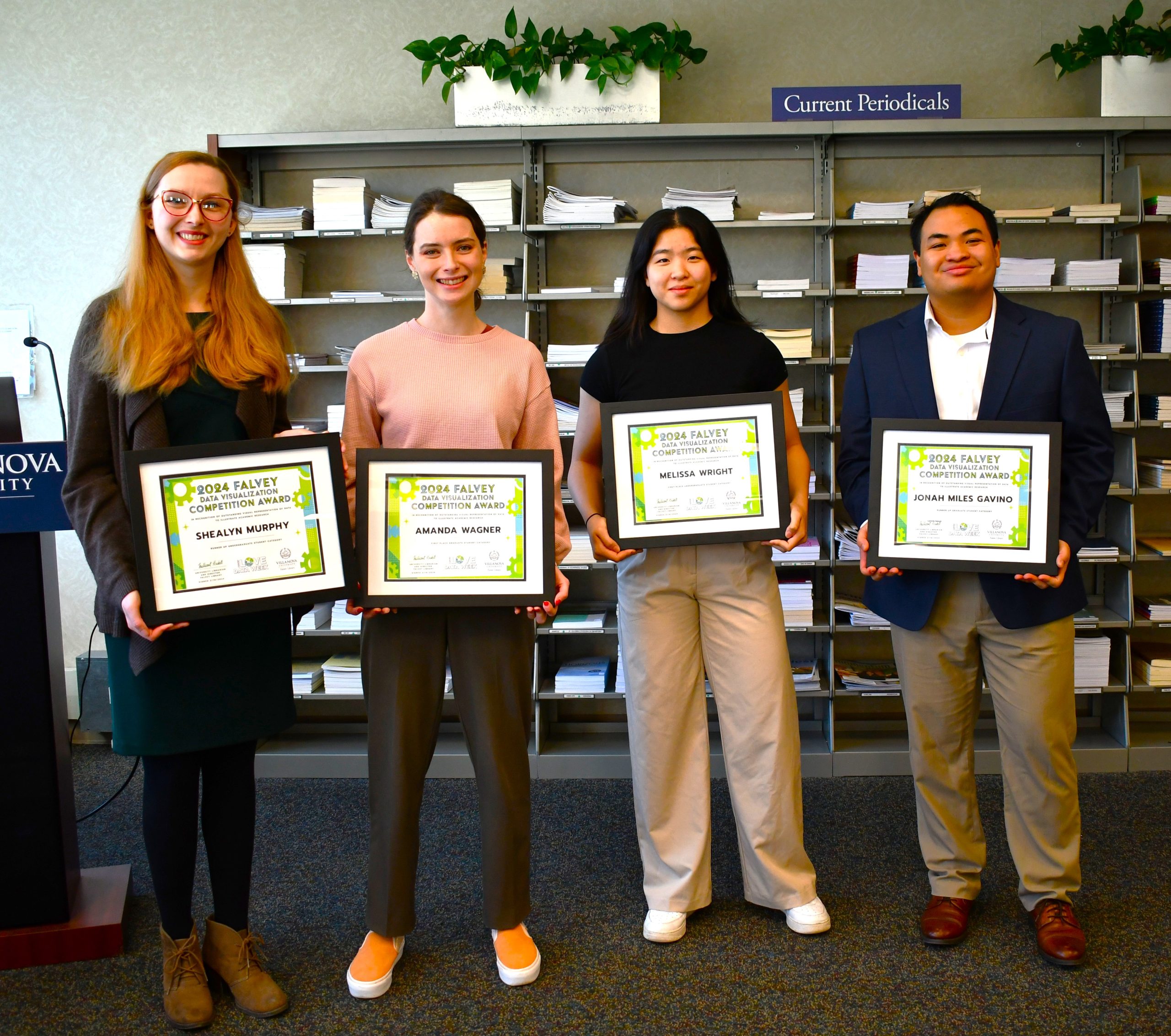
Congratulations to the 2024 Falvey Data Visualization Competition award winners! From left to right: Nicole Daly, Social Sciences Librarian, recognizing Shealyn Murphy, Amanda Wagner, Melissa Wright, and Jonah Miles Gavino. Check out their award-winning projects here.


Kallie Stahl ’17 MA is Communication and Marketing Specialist at Falvey Library.


Like
1 People Like This Post

The Visual Representation of Data

By Jutta Seibert

Elmer R. Kottcamp, Weather
Vane, c. 1941, watercolor and
graphite on paper, 43.9 x 31 cm.
Courtesy of the National
Gallery of Art, Washington D.C.

Visual representations of data help us understand numbers and their relationships with each other at their best, at their worst they misrepresent and distort what they represent. In our data-driven world visual literacy has become a critical component of information literacy. Thus, it should come as no surprise that this year the Library included a data visualization competition in its Love Data Week lineup.

Humans are remarkable adept at creating and understanding visual representations of data. While experts are divided on whether or not to count paleolithic cave drawings as early examples of data visualization, there is general consensus that maps are visual data communication tools. The information encoded on maps can be highly complex but nevertheless easy to grasp given a basic familiarity with coding conventions for maps. Some of these conventions are so ubiquitous that they are at times considered universal. This may be true today, but visual codes have changed over time. The four cardinal points are an interesting case in point. While we may consider the placement of the North at the top of a map as universal, not all maps follow this convention: Some Medieval European maps show East, where Jerusalem was situated, at the top of the map, Islamic maps often show the South at the top, and last, but not least, modern GIS systems show the travel goal and not one of the cardinal directions at the top.

Modern computing technology has put a wide range of data visualization tools at our fingertips. We are only a few clicks away from transforming data points on a spreadsheet into picture-perfect pie charts, bar graphs, tree maps, and scatter plots. In fact, creating visualizations is generally easier than understanding some of them. There is evidence that many data visualizations produced today are either nonsensical, pedestrian, or outrightly misleading. Numerous websites and publications are dedicated to the misrepresentation and distortion of data through visualizations. Similarly, a range of academic journals are dedicated to the topic of data visualization in various fields ranging from business to science, and the humanities. In a world where enormous amounts of data are continuously collected, both intentionally and unintentionally, data analysis and data communication are considered basic skills in many professions. Today, visual and data literacy are important components of basic information literacy.

Minard, Charles Joseph. “Representation of successive human loss during the Russia campaign of the French Army, 1812-1813.” Courtesy of the Bibliothèque Nationale de France.

Truly great data visualizations are rare. They tell a story and focus our attention. No specialized data analysis training is needed to understand their message. One of the most widely referenced examples is Charles Joseph Minard’s visualization of the human loss suffered by the French Army during the 1812-13 invasion of Russia and subsequent retreat. Minard’s mash-up of a map and flowchart poignantly shows the stark realities of human loss caused by war. Edward Tufte, a widely respected authority on visualizations and author of multiple works on the topic, calls it “the best statistical graphic ever drawn” on his website.

Explore our recommended reading list below if you are interested in the topic and join us on Friday, February 16 at 10 a.m. for Falvey’s first Data Visualization Competition awards ceremony.

Recommended Readings and Websites

Jutta Seibert is Director of Research Services & Scholarly Engagement at Falvey Memorial Library.


Like
1 People Like This Post

Our Kind of Data

Learn more about Love Data Week at ICPSR. #LoveData24 

Falvey loves data, all kinds of data, and we want to celebrate Love Data Week by talking about the different ways data is used on campus. At Villanova University we have many disciplines across campus, and each of them use data in their own way. Now how each discipline uses data might not always be as obvious, such as in the social sciences and humanities, compared to the STEM fields, and that is why we want to illustrate some of the ways data has been used across the disciplines that aren’t quite as obvious. In the world of librarianship, data plays a role in many of our decisions. In thinking about how we decide whether a program was successful or whether we are going to renew a resource for another year we rely on data to inform our decisions. Each year we evaluate the resource subscriptions we are going to keep, and we do this by examining the usage data collected. 

Sarah Wingo, Librarian for English Literature, Theatre, and Romance Languages and Literature, offered the following demonstration of how data can be used to explore literature. 

“Often when we think of data we think of massive data sets too big for a human to ever hope to analyze, but using data to better understand literary texts is not new to scholars of English literature nor does it always have to be at such an enormous scale. One of the more famous examples of using data to better understand a literary text has to do with Shakespeare’s First Folio. In 1920 Thomas Satchell noticed a distinct difference in spellings of 35 words in the first half of McBeth to the second half. Other scholars such as Edwin Eliott Willoughby in 1932, and Alice Walker in 1954 would further contribute to this idea by expanding the investigation to the rest of the First Folio and positing that there were multiple compositors who worked on type setting the First Folio. These early researchers were attempting to use meticulous textual analysis to do what we often use computers to do today, which is gather textual data to provide us with new information about a text, in this case how many different compositors may have worked on the typesetting for the first folio. Helping scholars to not only better understand how printing houses worked in the 1620s, but also helping scholars to better understand the text we are left with.”

For more on this ongoing debate over the First Folio: https://www.gabrielegan.com/publications/Egan2012d.htm

Further Reading:

Eve, Martin Paul. The Digital Humanities and Literary Studies. First edition. Oxford University Press, 2022. https://library.villanova.edu/Find/Record/2835904?sid=146389460

Underwood, Ted. Distant Horizons: Digital Evidence and Literary Change. The University of Chicago Press, 2019. https://library.villanova.edu/Find/Record/1954455?sid=146390124

Sarah’s example of how researchers have been able to analyze the spelling of texts to explore authorship of classic pieces, is just one way that researchers create and use data. In the field of Communication and Literature, research data can be created by counting the frequency of certain terms, or even by examining the tone used in a work. Research on tone can look at the proportion of positive or negative words used in a piece. An interesting topic of study that has crossed disciplines, is the examination of the media’s portrayal of mental health. This is a topic that has been explored by Sociologists, Psychologists, and the Communication field. Each of these disciplines have explored how news articles have dealt with mental health, though the questions they have looked to answer might vary due to their focus. The research question often shapes the type of data being created and used, with one focus of this topic having been to answer whether there has been a change in perception of mental health in the news over time. Compiling a collection of hundreds and even thousands of news articles, a text analysis is able to show the overall tone of articles depicting mental health and whether there has been a shift in tone between the years. Interested in your own text analysis? Check out Gale’s Digital Scholar Lab in our Databases A to Z list, where you can explore the Gale collection and conduct text analyses.   

Further Reading: 

Chen, M., and S. Lawrie. “Newspaper Depictions of Mental and Physical Health.” BJPsych Bulletin, vol. 41, no. 6, , p. 308, https://doi.org/10.1192/pb.bp.116.054775. https://library.villanova.edu/Find/EdsRecord/edselc,edselc.2-52.0-85036633598 

R, Whitley, and Wang J. “Good News? A Longitudinal Analysis of Newspaper Portrayals of Mental Illness in Canada 2005 to 2015.” Canadian Journal of Psychiatry. Revue Canadienne De Psychiatrie, vol. 62, no. 4, 2017, pp. 278-285, https://doi.org/10.1177/0706743716675856. https://library.villanova.edu/Find/EdsRecord/cmedm,27777273 

Please join us in celebrating another year of data appreciation, where you can learn about some of the wonderful resources available to Villanova affiliates through Falvey Library and how students on campus are working with data. Check out our Love Data Week 2024 events page and register for one, or all, of our events! 

For more information about different data resources Falvey offers check out the Falvey library blog. There will be different data related posts throughout the week! Follow and spread the word about Love Data Week 2024: @lovedataweek on X and Instagram #lovedata24 

Make sure to join us again next year for Love Data Week 2025, which will run from Feb. 10-14.


Headshot of Nicole Daly, Social Science Librarian.Nicole Daly is Communication Librarian at Falvey Memorial Library. 

Like
1 People Like This Post

Announcing the ’24 Love Data Week Events

Love Data Week Events


The Villanova Community is invited to join us for our exciting line-up of Love Data Week events during the week of Feb. 12!

Love Data Week 2024 is about highlighting the various representations of “my data,” such as showcasing the work that goes into making data, recognizing data equity and inclusion factors for the people participating in or affected by data, and documenting the data standards from (inter)disciplinary communities. This year we’re focused on helping new and seasoned data users find data training and other resources that can help them work with their kind of data.

Please register for the upcoming Love Data Week Events:

  • Introduction to Data Visualization: Monday, Feb. 12, 12–1 p.m. (Virtual) REGISTER HERE
  • Intro to Python: New Date! Tuesday, Feb. 20, 10–11 a.m. (Virtual) REGISTER HERE
  • Excel for the Humanities:  New Date! Tuesday, Feb. 20, 12–1 p.m. (Virtual) REGISTER HERE
  • Scraping Data from the Web (into R): Wednesday, Feb. 14, 12–1 p.m.(Virtually or Room 205) REGISTER HERE
  • Introduction to Citation Metrics and Research Impact: Wednesday Feb. 14, 4–5 p.m. (Virtual) REGISTER HERE
  • Text Analysis: Gale’s Digital Scholar Lab and Copyright: Thursday, Feb. 15, 12–1 p.m. (Virtual) REGISTER HERE
  • Falvey Data Visualization Competition Awards Ceremony on Friday, Feb. 16, 10–11 a.m. (Speakers’ Corner) Registration is not required for this event.

There will also be interactive tabling on Falvey’s first floor throughout the week.


Like

Coming Soon: Love Data Week 2024!

Love Data Week Banner

By Nicole Daly

It’s that time of year again, planning for Love Data Week is underway and we hope you can join us at one, or all, of the many events we will be hosting this upcoming year. Please save the date for Love Data Week 2024, which will be from February 12-16, 2024. We have a lot of great events planned this year, including our new Falvey Data Visualization Competition. #LoveData24

For more information about different data resources Falvey offers keep an eye on the Falvey Library blog, where there will be different data related posts throughout the week! Make sure to check out the different workshops we will be hosting during the week.

To find out more about how Falvey has celebrated Love Data Week in the past check out last year’s event page. You can find our Love Data Week page, in our Data Services section, where you’ll be able to find links to past events, read some of our data related blog posts, and see how far reaching our events have been in past years. This page will not only provide you an overview of what Love Data Week is and how we’ve celebrated it in the past, it will also link to all of the amazing upcoming events so you can register to join us this year!


Headshot of Nicole Daly, Social Science Librarian.Nicole Daly is Communication Librarian at Falvey Library.


Like

Falvey Data Visualization Working Session!

Register Here.

The Falvey Data Visualization Competition is a new program established in conjunction with our annual Love Data week celebration to recognize the various ways that data is used in Villanova scholarship. Winners will be selected from the pool of candidates by the Love Data committee based on set criteria, judging the utilization of data and visualizations to illustrate their research. This competition is open to undergraduate and graduate students from Villanova University. Presentations can be based on any type of data-related project that students have completed or are currently working on. Presentations can be submitted beginning Monday, Jan. 1, 2024. 

Follow and spread the word about Love Data Week 2024: @lovedataweek on X and Instagram #lovedata24 

Questions? Contact Nicole Daly, Social Science Librarian.


Headshot of Nicole Daly, Social Science Librarian.Nicole Daly is Communication Librarian at Falvey Library.


Like
1 People Like This Post

Enter Falvey’s Data Visualization Competition—Show Us How You Use Data!


The Falvey Data Visualization Competition is a new program established in conjunction with our annual Love Data week celebration to recognize the various ways that data is used in Villanova scholarship. Winners will be selected from the pool of candidates by the Love Data committee based on set criteria, judging the utilization of data and visualizations to illustrate their research. This competition is open to undergraduate and graduate students from Villanova University. Presentations can be based on any type of data-related project that students have completed or are currently working on. Presentations can be submitted beginning Monday, Jan. 1, 2024. Questions? Contact Nicole Daly, Social Science Librarian.


Like

Love Data Week 2023 – Data: Agent of Change

Help us celebrate Love Data Week, the international celebration of all things data related! Love data is a week dedicated to raising awareness and celebrating how data influences our world! 

This year’s theme is “Data: Agent of Change,” focusing on inspiring significant change through data, whether large or small, ranging from policy change, structural change, and social change! If you have not participated previously, now is the time! To help new and seasoned data users find data training and resources to move the needle on issues they care about, I have created a list of resources one could use to explore those issues. 

With February also being Black History Month, I wanted to bring attention to some of the research and data sources available covering issues with race, not only in the U.S. but worldwide.   

Check out these resources to learn more. 

U.S. Census Information on Race: https://www.census.gov/topics/population/race.html  

Race, Ethnicity and Marriage in the United States: https://www.census.gov/library/stories/2018/07/interracial-marriages.html  

Pew Research Center Race and Ethnicity information: https://www.pewresearch.org/topic/race-ethnicity/ 

ICPSR is a data repository available to Villanova students, faculty, and staff. They host a variety of datasets that have been curated for ease of use, including many sets dealing with social issues. Two helpful features they offer are the Thematic Data Collections, which includes the Resource Center for Minority Data, and their Current Events in the Bib page, which shows publications dealing with current society issues and how data is being used in to broaden the scholarship. Explore ICPSR to find datasets available for secondary analysis to advance policy and social change. 

The International Association for Social Science Information Service and Technology, IASSIST, recently released a webinar titled “A Conversation About Data on Race & Ethnicity Around the World By Bobray Bordelon, Barbara Levergood, Kevin Manuel, Nigel de Noronha, Anja Perry, and Anne Zald. The panel was moderated by Alexandra Cooper and Deborah Wiltshire.

Erica Hayes, Digital Scholarship Librarian, recommends the book, Data Feminism by Catherine D’Ignazio and Lauren Klein. “The book touches on why data scientists need feminism and how data can perpetuate intersectional inequalities. The book also provides examples of different projects like Data for Black Lives: https://d4bl.org/.” 

It is important to also highlight some of the inherent issues that are prevalent in data science. Beaudry Allen, University Archivist, recommends Algorithms of Oppression: How Search Engines Reinforce Racism by Safiya Noble to learn more about the systematic racism found in data science. 

For more information about different data resources Falvey offers check out the Falvey library blog. There were different data related posts throughout the week! Make sure to join us again next year for Love Data Week 2024, which will run from Feb. 12-16.

Follow and spread the word about Love Data Week 2023: @lovedataweek on Twitter and Instagram #lovedata23 

This event is hosted by ICPSR, a data repository that is available on Falvey Library’s homepage, Databases A-Z list. 


Headshot of Nicole Daly, Social Science Librarian.Nicole Daly is Communication Librarian at Falvey Library.


Like

Show Your Love – Adopt a Dataset!

By Jutta Seibert

At long last, Love Data Week is here! Every year the Inter-University Consortium for Political and Social Research, better known as ICPSR, hosts Love Data Week in February and invites the academic community to adopt datasets to show their love for data-driven research.

At its core, ICPSR is a data archive that offers a range of value-added services such as online analysis, educational programs, and data management tools. Students, faculty, and staff associated with Villanova University have access to the complete menu of services and archived datasets. Questions regarding ICPSR should be directed to the University’s official ICPSR representative, Social Sciences Librarian Nicole Daly.

The sheer size of the archive is difficult to grasp for anyone not familiar with ICPSR. However, finding relevant data is amazingly easy. Search terms are matched not just to variables or dataset descriptions but also to data-related publications. Most important of all, ICPSR is not just for political scientists and sociologists, as its name may imply; humanists and historians are among the scholars who deposit qualitative as well as quantitative data. ICPSR hosts self-published replication data sets through openICPSR. Keep this in mind for the next time a research grant requires you to share your data for replication purposes.

To show my love of data I adopted the Berry Slave Value Database. Choosing one dataset from the multitude of data available on the topic of slavery was not easy. So many options and so little time. In the end it came down to a choice between Dr. Berry’s dataset, which offered historical sale and appraisal prices covering the years 1797 through 1865 from ten U.S. states, and the data archived by Drs. Fogel and Engerman, which include historical sale and appraisal prices covering the years 1775 through 1865 from eight southern states. I chose to adopt Dr. Berry’s dataset, which was submitted through the OpenICPSR program. OpenICPSR datasets can only be analyzed by downloading them from ICPSR into statistical software, whereas many of the ICPSR curated datasets can be analyzed online on the ICPSR website. The Berry Slave Value Database features research data that Dr. Berry collected for her monograph The Price for Their Pound of Flesh: The Value of the Enslaved, From Womb to Grave, In the Building of a Nation, which is available at Falvey in print as well as electronically.

Falvey staff invites you to take a closer look at what ICPSR has to offer and to adopt a dataset this week whether you are a humanist or a social scientist. For more information about ICPSR and some of the other data resources Falvey offers, join us throughout the week in one of our lunch workshops. Join us online using the hashtag #LoveData23 to see how institutions around the world are celebrating Love Data 23.


Jutta Seibert is Director of Research Services & Scholarly Engagement at Falvey Memorial Library.


Like

Join Falvey Library for Love Data Week Events!

Love Data Week poster


Join us for Love Data Week at Falvey, which runs from Monday, Feb. 14 through Friday, Feb. 17, 2023.

First, Nicole Daly, Social Science Librarian, will present a virtual workshop titled “Falling in Love with Data” on Tuesday, Feb. 14 .  REGISTER HERE.

This beginner workshop will provide an overview of ICPSR, an online data archive available to social science researchers. Topics covered will include an overview of ICSPR’s data services; from a quick outline on navigating the website, to finding and using data sets for analysis. In this Valentine themed session, we will demonstrate how to search for a relevant dataset using ICPSR’s various search options, explore the tools available in ICSPR’s data records, and take a quick look at their new Analyze Online feature.

Next, Michele Gandy, GIS Laboratory Manager, Department of Geography and the Environment, will present a virtual workshop titled “Present Real-Time Analytics with ArcGIS Dashboards”  on Wednesday, Feb. 15.  REGISTER HERE.

A dashboard is a view of information and data that allows you to monitor events, make decisions, inform others, and see trends. ArcGIS Dashboards enables users to convey information by presenting location-based analytics using intuitive and interactive data visualizations on a single screen. Join Michele Gandy, GIS Lab Manager in the Department of Geography and the Environment to learn how to create these informative dashboards with your own data.

Finally, Erica Hayes, Digital Scholarship Librarian, will present a virtual workshop from 12–1 p.m. titled “Introduction to Data Visualization” on Thursday, Feb. 16 . REGISTER HERE.

In this introductory workshop to data visualization, participants will gain an understanding of the process for making good visualizations. Data visualization is a vital part of data analysis as we conduct our research, but accurate and readable charts are also important for conveying information to our colleagues, students, or other audiences. In this introductory workshop, participants will review best practices, online resources, and core design concepts for creating basic data visualizations. Participants will learn about various tools for choosing chart types whether you’re trying to visualize a relationship, comparison, hierarchy, or process.

These ACS-approved events will take place from 12-1 p.m. and are a part of the Spring 2023 Falvey Forum Series.  


Like

Next Page »


Last Modified: February 13, 2023

Ask Us: Live Chat
Back to Top