Skip Navigation
Falvey Library
Advanced
You are exploring: Home > Blogs

Library 101: VISIT THE LIBRARY BLOG AND SOCIAL MEDIA FOR DAILY UPDATES

Check out our website and social media every day for the latest library news, resources, and fun stuff!

WEEKLY BLOGS

Monday

Tuesday

Wednesday 

Thursday


Friday 


SOCIAL MEDIA


Like

Library 101: Visit the Library Blog and Social Media for Daily Updates


Check out our website and social media every day for the latest library news, resources, fun stuff, and throwbacks!

Weekly Blogs

Monday

Tuesday

Wednesday 

Thursday


Friday 


Social Media


Kallie Stahl ’17 MA is Communication and Marketing Specialist at Falvey Memorial Library.


Like
1 People Like This Post

Weekend Recs: Social Media

Happy Friday, Wildcats! After a year off, Falvey Memorial Library is bringing back Weekend Recs, a blog dedicated to filling you in on what to read, listen to, and watch over the weekend. Jenna, a graduate assistant from the Communication department, scours the internet, peruses the news, and digs through book stacks to find new, relevant, and thought-provoking content that will challenge you and prepare you for the upcoming week. 

If you’ve read anything in the news this week you probably noticed that Facebook has been under fire. Also, Facebook was down for about SIX HOURS on Monday, as well as Facebook’s other social holdings, Instagram and WhatsApp. What was that about? If you want to catch-up on everything going on in the Facebook and social media world, check out these recs. 

If you have 1 minute… follow Falvey Memorial Library on Facebook, Instagram, and Twitter to keep up with all our updates! 

If you have 2 minutes… Read the first half of this article from The Skimm that gives the highlights on Facebook’s whistleblower and the leaked findings regarding Facebook, Instagram, and teens’ mental health.   

If you have 5 minutes… Read this article from NPR about the Facebook outage on Monday. Also, you can read Zuckerberg’s full statement here. 

If you 1 hour and 34 minutes… Watch the Social Dilemma on Netflix to learn about the potentially dangerous impact of social networking. 

If you have 2 hours… Watch The Social Network on Amazon Prime to learn about Mark Zuckerberg and the founding of Facebook. 

If you have at least 8 hours and 30 minutes… Read App Kid by Michael Sayman, the story of one of Silicon Valley’s youngest entrepreneurs–a second-generation Latino immigrant.   


""Jenna Renaud is a graduate student in the Communication Department and graduate assistant in Falvey Memorial Library.


Like
1 People Like This Post

#ColorOurCollections 2017 Gallery

Here is a round-up of colored images from last week’s #ColorOurCollections extravaganza!

The Bosun and the Comet, colored by Laura B.

The Bosun and the Comet, colored by Laura B.

The Camelopard, colored by Laura B.

The Camelopard, colored by Laura B.

Cover of Comfort, August 1907, colored by Liz A.

Cover of Comfort, August 1907, colored by Liz A.

Cover of Comfort, February 1904, colored by Sue O.

Cover of Comfort, February 1904, colored by Sue O.

Dragons, colored by Sue O.

Dragons, colored by Sue O.

Even though #ColorOurCollections 2017 is over, you can keep coloring all year! Find all of our coloring pages here in the Digital Library.


Like
1 People Like This Post

#ColorOurCollections 2017!

Photo of coloring pages and colored pencils.

Sharpen your pencils & crayons! It’s time for #ColorOurCollections!

This week marks the return of #ColorOurCollections, a social media campaign that presents coloring pages adapted from the collections of cultural heritage institutions. For today, you can find remastered copies of last year’s coloring books in the Digital Library. These coloring books feature the work of Jack B. Yeats, a selection of fantastic beasts, and a selection of covers from the magazine Comfort.

Coloring page from The Bosun & the Bob-tailed Comet.Coloring page with images of dragons.Coloring page of the cover of Comfort magazine, February 1904.

If you color any of our images, be sure to share your masterpieces on social media using the hashtag #ColorOurCollections and tag us so we don’t miss it! You can find our social media profiles in the “About the Collections” section at the bottom left of the Digital Library home page.

Follow the hashtag across social media or check out the website hub at colorourcollections.org to find more coloring pages from cultural heritage institutions around the world! Thank you to the New York Academy of Medicine for organizing another year of #ColorOurCollections!

Happy coloring! 🙂


Like
1 People Like This Post

Nursing students & social media / Hunting for drugs to combat Zika

Facebook, Instagram, Snapchat, text messaging….so many ways to stay in touch and share information with friends.  However, nursing students need to be aware of the ethical and legal ramifications surrounding the use of social media during their clinical experience.  Patient confidentiality is only one of several important factors to consider.  The ANA Code of Ethics for Nurses with Interpretive Statements (2015 e-book ed. available through Falvey Library) specifically addresses the issue of social media use.  Court cases have ensued!

Here’s an article on the topic you may wish to share with your students:

Westrick, S. J. (2016). Nursing students’ use of electronic and social mMedia: Law, ethics, and e-professionalism. Nursing Education Perspectives, (1), 16-22. doi:10.5480/14-1358

Click to access.

Fighting the Zika Virus

Read a recent article in Nature Medicine reporting on the hunt for antivirals to combat the Zika virus:

Kincaid, E. (2016). A second look: Efforts to repurpose old drugs against Zika cast a wide net. Nature Medicine, 22, 822-825. doi:10.1038/nm0816-824

Click to access.

Here’s a research article, also from Nature Medicine, on investigators’ discovery that niclosamide, a medication commonly used to treat tapeworm, has shown promise in preventing the replication of the Zika virus in the fetal brain.

Research questions?  Contact Barbara


Like

#ColorOurCollections

This week we’re celebrating some of the cool stuff in our collections by creating coloring books for you to enjoy!

For today, we’ve got a coloring book version of Jack B. Yeats’s The Bosun And The Bob-Tailed Comet (1905). We’d love to see what you color, so tweet an image of your masterpiece and include @VillanovaDigLib and #ColorOurCollections in your tweet text. Stay tuned for more coloring opportunities later this week!


The New York Academy of Medicine (NYAM) and the Biodiversity Heritage Library came up with the (brilliant!) idea for #ColorOurCollections and you can find lots of cool stuff to color from Special Collections libraries around the world by browsing the hashtag on Twitter! NYAM will also be featuring some of the #ColorOurCollections treasures on their blog.

Happy coloring! 🙂


Like

Responsive?

If you follow Villanova’s Digital Library on Twitter, you may have seen this tweet recently:

Check out our new responsive design (thanks to @crhallberg!): http://t.co/VmWL30gonx Play around & let us know what you think! #webdesign

— VillanovaDigitalLib (@VillanovaDigLib) December 5, 2013

Proud to say that the shout-out refers to me, Chris Hallberg, and I’m going into my third year of working on the front end of the Digital Library. That probably doesn’t mean much to you though, so let’s cut to the chase.

“Responsive”?

aka. what is Chris’ job?

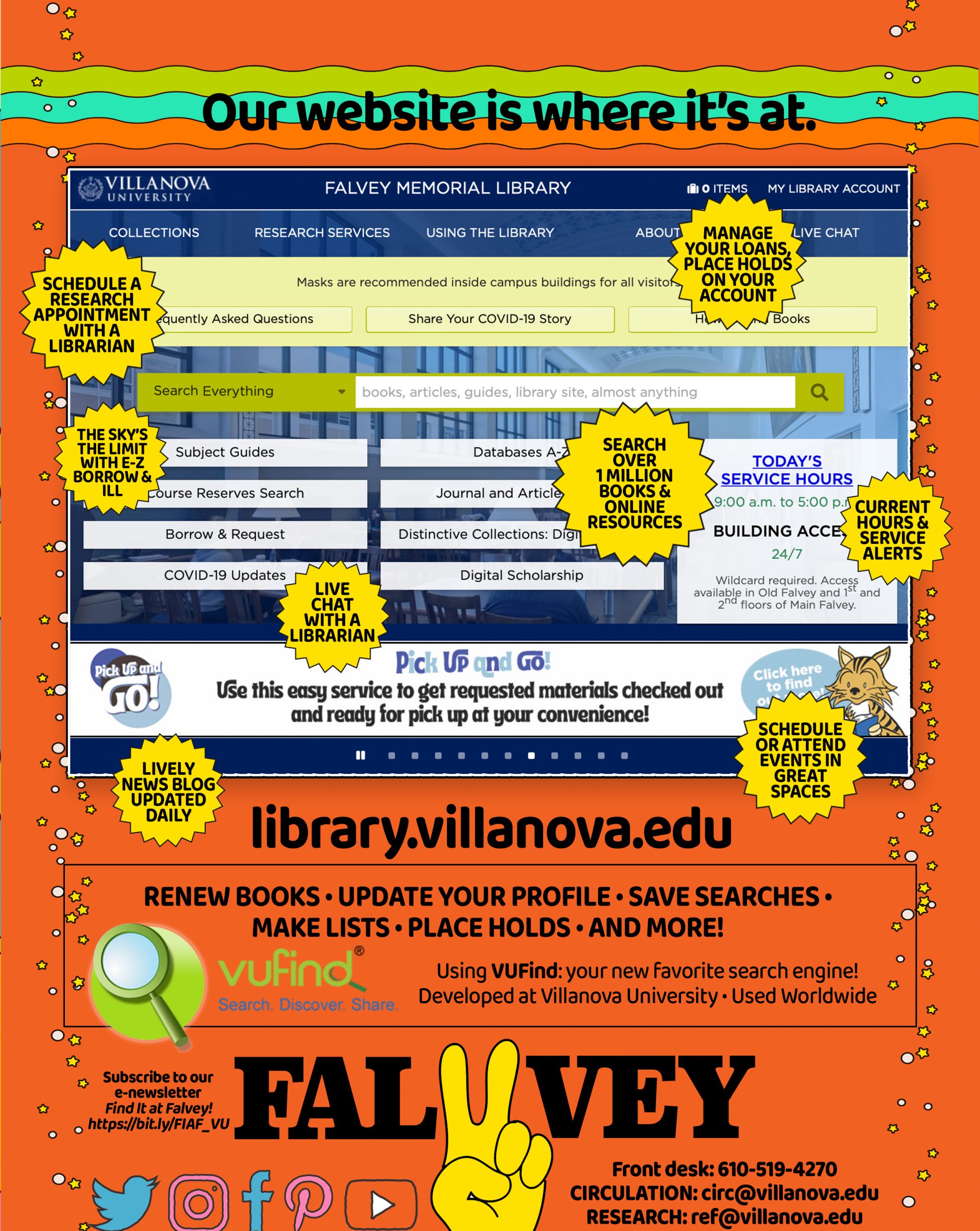
That’s a fancy way of saying that the design of the website adapts to any size screen that it’s viewed on. This is an evolution from the design model of having two completely different websites to handle desktop users (ie. Wolfram Alpha) and mobile users (Wolfram Alpha again, mobile edition). There’s two major problems here: developers have to design, build, test, deploy, host, and update two separate sites; and some functionality is lost.

Faster browsers, faster Internet speeds, and updated web technologies allow web builders to create more powerful web pages than ever before. Web users know this, and they don’t want to settle. They demand the complicated features of the “full” website on their phones and more and more users and mobile browsers try to use their ever increasing phone sizes to look at the desktop version. If you’ve ever tried this, you’ll know a lot of full websites look terrible on phones. This is where responsive design saves the day.

The biggest problem with smaller screens causes features normally laid horizontally, like this text and the navigation on the left, to clobber each other when the real estate vanishes or to become so tiny the crushed text within looks like something out of House of Leaves. Worst, in my opinion, is the horizontal scroll bar that turns your browser into a periscope in a vast, hidden field of content.
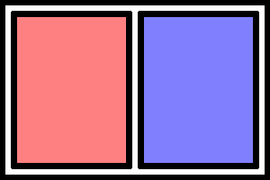
normal
Normal

squish
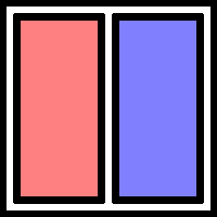
One word per line necessary to fit in these tiny columns
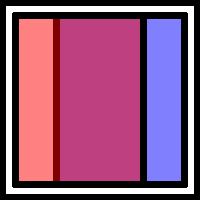
overlap
Clobber-ation

scroll
Bum bum bum

Responsive design actively reorganizes the page so that this doesn’t happen.
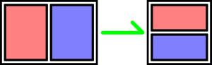
responsive
That’s better

“Play around”?

Here’s how to properly play with this blog to enjoy responsive design.

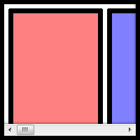
If this window is full screen, click the resize button (next to the close button) on this window so that you can see all the edges of the window. Now, drag the right edge of the window to the left, squeeze the window if you will. Come on. It’s ok, no one’s watching. If you don’t do it, the rest of this blog won’t make any sense. Thank you.

The first thing that will happen is that the navigation buttons above (called “pills”) will jump below the search bar. Then, the menus on the very top and below the search bar will collapse into buttons.

Pause a moment. You are entering the land of the Mobily-Sized Browser Window. We designed the new library and digital library web sites to reorganize itself when you look at it on any screen the size of an iPad or smaller. In this case, the menu on the left (and up) is going to move on top of this blog post and fill the available space. We spare no expense! Just keep an eye on the search bar as you squeeze the window down as far as you’d like.

That’s responsive design at work.

What’s going on here?

In order to make websites look beautiful, developers use a language of rules called CSS, short for Cascading Style Sheets. It looks like this:

button { ← What are we applying the “rules” below to?
   background: #002663; ← Villanova blue in code
   color: white; ← Color of the text
   border: 1px solid black;
   border-radius: 4px; ← Rounded corners!
   height: 45px;
   width: 90px;
   margin: 3px ← Distance from border to the next element
   padding: 14px 4px; ← Distance from border to content
} ← That’s enough rules for our buttons

That code is more or less how we made the four pills next to the search bar look so pretty.

A year and a half ago, the powers that be added a new feature to CSS: media queries. Media queries can tell us all kinds of things about how you’re looking at our web pages. We can tell whether or not you’re running your browser on a screen, mobile device, TV, projector, screen reader, and even braille reader. It can also tell if you’re holding your phone sideways or vertically, what colors it can display, and (most importantly) what the dimensions of your screen are. By putting code like our button example inside these queries, we can apply rules, like fonts, colors, backgrounds, and borders, to elements of the page depending on the context of the browser.

@media print { ← If we’re printing something
  // Hide ads and colorful content
}
@media (max-width: 768px) { ← Anything thinner than a vertical iPad
  // Show a special menu for mobile users
}

Responsive designs are built right on top of this technology.

Browsers are really good at stacking things on top of each other. This paragraph is under the previous one. This makes sense and it’s quite easy on your eyes, and your computer. With a few CSS rules, we can tell the browser to put things next to each other. The trick is to put things next to each other, until it’s impractical to do so. Being able to tell your web site where to put things and how they look depending on how and where your user is looking at it is what responsive design is all about.

The Magician’s Secret

Before media queries were invented, developers had to write some pretty serious code. This code had to constantly watch the size of the screen and then, basically, rewrite the files where the CSS rules are kept. It was very complicated, which is why it made much more sense to create two completely different sites and route users to each depending on their “user agent,” a small snippet of information that your browser sends to a server when you open a page in your web browser. The problem is, these bits of information were made for people to read for statistical reasons, so they are complicated and change every time a browser updated to a new version. It was a digital guessing game.

Some of the people behind Twitter decided to make a framework that web developers could build on. Instead of starting from scratch, developers could start with their collection of code and CSS that pre-made a lot of common elements of web sites like tabs, accordions, and toolbars, for them. They called it Bootstrap. In 2011, they added responsive design, making it easy for developers to create a site that looked good on any device. In 2012, a graduate assistant named Chris Hallberg was charged with rebuilding the Digital Library front end. In 2013, he, along with web developers all over campus, made Villanova’s web presence responsive. Without this framework, creating a responsive site would have taken much, much longer, and possibly wouldn’t have occurred at all. Not only was it an essential tool to the process, it is a broadcasting platform for the technology. Bootstrap makes responsive design possible and popular.

A Final Word

While I did the work you see over at the Digital Library, I did not create the page you are looking at. I can only take credit for the menu on the left, which I’m clearly very fond of. David Uspal was the magician who conjured this page’s design and David Lacy is the magician behind-the-scenes, organizing and delivering the thousands of books containing the tens of thousands of images we’ve scanned. We both received invaluable input from the Falvey Web Team and even viewers like you. Your feedback helped and continues to help us fix errors and typos, and (most importantly) pick the colors for our pretty new web site.

Enjoy!
– Chris Hallberg

PS. A fun example of the new power of the web is Google Gravity from the gallery of Chrome Experiments.
PPS. As a reward to offset the new habit you’ve developed of resizing every window you find, here’s an accordion to play.


Like

The Digital Library: now more social!

Our Special Collections and main scanning lab have been restricted to limited access due to renovations in the library, but of course we’re still available online! And over the summer, we became a lot more social! Social media, that is. The icons and links for all of our social media accounts now appear on the Digital Library home page, but here’s a breakdown of the types of things posted to these accounts:

Twitter: Random selections from our collections as well as interesting news related to digital libraries.

Facebook: News and highlights from the Digital Library.

Tumblr: We had a Tumblr account before, but it was languishing for a while, so I’m refreshing it now. This is for slightly longer posts than Twitter or Facebook, but still shorter than here on the Blue Electrode blog, hence the Tumblr is called Blue Electrode Lite.

Flickr: Again we’ve had Flickr for a while now and I have been updating it (semi)regularly, but I just wanted to link to it again with our other social media accounts. I pick random pages from inside longer books, so this is a good way to discover some interesting content you might not know about unless you paged through an entire volume. You can also interact with the images here by adding tags, notes, or comments.

While I’m here, I’ll also mention that we have a Facebook and Twitter for our open source digital library administration application, VuDL, as well.

All of these accounts are curated by me (Laura) and I’ve noted that on all of the account profiles. I like people to know there’s a friendly face behind the institutional/product name on the accounts!

Please follow along with one or more of these accounts and feel free to ask questions or post comments! (The same applies right here on the Blue Electrode, too, of course!) And if I can’t answer your question myself, I’ll find someone who can. Social media is for conversations, so I would love to hear from you!


Join the conversation! [image source]


Like

We’re on Flickr!

The Digital Library is now on Flickr! I created our account in June and have since added 85 images (and counting!).

A view of Philadelphia from the Delaware River in 1753.

Most of the images come from our collections on the Digital Library and I’ve created image sets that mirror some of the main collections there, as well as two new collections: Adverts and Scenes. As you might guess, the Adverts set contains advertisements from the pages of some of the books in our Digital Library. I’ve pulled the ones that struck me as interesting or noteworthy in some way.

Advertisement for Villanova.

The Scenes set contains Flickr-exclusive images that don’t fit into any of our regular collections. These will mainly be random photos I take while wandering around campus photographing trees.

Bee.

The majority of these images are all available on the Digital Library, of course, but our Flickr account provides another point of access and highlights some of the interesting images that are easy to miss if you don’t look through every page of every item on the Digital Library. In addition, Flickr allows you to interact with our images by adding notes, tags, and comments.

Come check us out! I know I’m having fun finding images to post there, so hopefully you’ll find something new and interesting, too!


Like


Last Modified: August 20, 2010

Ask Us: Live Chat
Back to Top