If you follow Villanova’s Digital Library on Twitter, you may have seen this tweet recently:
Check out our new responsive design (thanks to @crhallberg!): http://t.co/VmWL30gonx Play around & let us know what you think! #webdesign
— VillanovaDigitalLib (@VillanovaDigLib) December 5, 2013
Proud to say that the shout-out refers to me, Chris Hallberg, and I’m going into my third year of working on the front end of the Digital Library. That probably doesn’t mean much to you though, so let’s cut to the chase.
“Responsive”?
aka. what is Chris’ job?
That’s a fancy way of saying that the design of the website adapts to any size screen that it’s viewed on. This is an evolution from the design model of having two completely different websites to handle desktop users (ie. Wolfram Alpha) and mobile users (Wolfram Alpha again, mobile edition). There’s two major problems here: developers have to design, build, test, deploy, host, and update two separate sites; and some functionality is lost.
Faster browsers, faster Internet speeds, and updated web technologies allow web builders to create more powerful web pages than ever before. Web users know this, and they don’t want to settle. They demand the complicated features of the “full” website on their phones and more and more users and mobile browsers try to use their ever increasing phone sizes to look at the desktop version. If you’ve ever tried this, you’ll know a lot of full websites look terrible on phones. This is where responsive design saves the day.
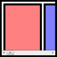
The biggest problem with smaller screens causes features normally laid horizontally, like this text and the navigation on the left, to clobber each other when the real estate vanishes or to become so tiny the crushed text within looks like something out of House of Leaves. Worst, in my opinion, is the horizontal scroll bar that turns your browser into a periscope in a vast, hidden field of content.
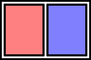
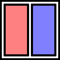
Normal
One word per line necessary to fit in these tiny columns
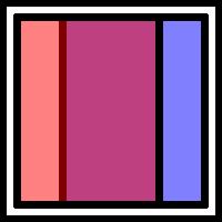
Clobber-ation
Bum bum bum
Responsive design actively reorganizes the page so that this doesn’t happen.
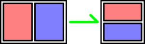
That’s better
“Play around”?
Here’s how to properly play with this blog to enjoy responsive design.
If this window is full screen, click the resize button (next to the close button) on this window so that you can see all the edges of the window. Now, drag the right edge of the window to the left, squeeze the window if you will. Come on. It’s ok, no one’s watching. If you don’t do it, the rest of this blog won’t make any sense. Thank you.
The first thing that will happen is that the navigation buttons above (called “pills”) will jump below the search bar. Then, the menus on the very top and below the search bar will collapse into buttons.
Pause a moment. You are entering the land of the Mobily-Sized Browser Window. We designed the new library and digital library web sites to reorganize itself when you look at it on any screen the size of an iPad or smaller. In this case, the menu on the left (and up) is going to move on top of this blog post and fill the available space. We spare no expense! Just keep an eye on the search bar as you squeeze the window down as far as you’d like.
That’s responsive design at work.
What’s going on here?
In order to make websites look beautiful, developers use a language of rules called CSS, short for Cascading Style Sheets. It looks like this:
button { ← What are we applying the “rules” below to?
   background: #002663; ← Villanova blue in code
   color: white; ← Color of the text
   border: 1px solid black;
   border-radius: 4px; ← Rounded corners!
   height: 45px;
   width: 90px;
   margin: 3px ← Distance from border to the next element
   padding: 14px 4px; ← Distance from border to content
} ← That’s enough rules for our buttons
That code is more or less how we made the four pills next to the search bar look so pretty.
A year and a half ago, the powers that be added a new feature to CSS: media queries. Media queries can tell us all kinds of things about how you’re looking at our web pages. We can tell whether or not you’re running your browser on a screen, mobile device, TV, projector, screen reader, and even braille reader. It can also tell if you’re holding your phone sideways or vertically, what colors it can display, and (most importantly) what the dimensions of your screen are. By putting code like our button example inside these queries, we can apply rules, like fonts, colors, backgrounds, and borders, to elements of the page depending on the context of the browser.
@media print { ← If we’re printing something
  // Hide ads and colorful content
}
@media (max-width: 768px) { ← Anything thinner than a vertical iPad
  // Show a special menu for mobile users
}
Responsive designs are built right on top of this technology.
Browsers are really good at stacking things on top of each other. This paragraph is under the previous one. This makes sense and it’s quite easy on your eyes, and your computer. With a few CSS rules, we can tell the browser to put things next to each other. The trick is to put things next to each other, until it’s impractical to do so. Being able to tell your web site where to put things and how they look depending on how and where your user is looking at it is what responsive design is all about.
The Magician’s Secret
Before media queries were invented, developers had to write some pretty serious code. This code had to constantly watch the size of the screen and then, basically, rewrite the files where the CSS rules are kept. It was very complicated, which is why it made much more sense to create two completely different sites and route users to each depending on their “user agent,” a small snippet of information that your browser sends to a server when you open a page in your web browser. The problem is, these bits of information were made for people to read for statistical reasons, so they are complicated and change every time a browser updated to a new version. It was a digital guessing game.
Some of the people behind Twitter decided to make a framework that web developers could build on. Instead of starting from scratch, developers could start with their collection of code and CSS that pre-made a lot of common elements of web sites like tabs, accordions, and toolbars, for them. They called it Bootstrap. In 2011, they added responsive design, making it easy for developers to create a site that looked good on any device. In 2012, a graduate assistant named Chris Hallberg was charged with rebuilding the Digital Library front end. In 2013, he, along with web developers all over campus, made Villanova’s web presence responsive. Without this framework, creating a responsive site would have taken much, much longer, and possibly wouldn’t have occurred at all. Not only was it an essential tool to the process, it is a broadcasting platform for the technology. Bootstrap makes responsive design possible and popular.
A Final Word
While I did the work you see over at the Digital Library, I did not create the page you are looking at. I can only take credit for the menu on the left, which I’m clearly very fond of. David Uspal was the magician who conjured this page’s design and David Lacy is the magician behind-the-scenes, organizing and delivering the thousands of books containing the tens of thousands of images we’ve scanned. We both received invaluable input from the Falvey Web Team and even viewers like you. Your feedback helped and continues to help us fix errors and typos, and (most importantly) pick the colors for our pretty new web site.
Enjoy!
– Chris Hallberg
PS. A fun example of the new power of the web is Google Gravity from the gallery of Chrome Experiments.
PPS. As a reward to offset the new habit you’ve developed of resizing every window you find, here’s an accordion to play.


